
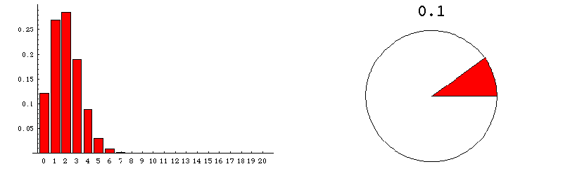
The animation below runs through the sampling distributions expected when samples of size 20 are draw from a very very large population of varying composition. These graphics deal with the sampling distribution predicted theoretically.
The pie chart on the right represents the population from which numerous samples are drawn. The proportion of the population that is red is indicated by the size of the red area--and also by the number appearing above the pie chart.
The bar graph on the left shows the sampling distribution which would be expected if many many random samples of size 20 were drawn. The numerical labels on the horizontal axis refer to the number of red units in a random sample. The height of the column that appears over the label "n" indicates the probability that a sample contains exactly n red units. For example, when the fraction of the population that is red amounts to 0.1, the bar over 3 has height approximately .19 (see the fixed graphic below the animation). This means that if millions of samples, each of size 20, were to be drawn from a population that was 10% red, then about 19% of the samples would contain 3 red units.
This shows the sampling distribution when the population is 50% red.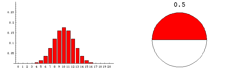
This page was made September 27, 1998 by Jim Madden, LSU. Updated, November 13, 2002.
Copyright information | Credits