Fall 2005 Capstone Project: Brachial Artery Dilation Analysis
Introduction
This particular project is a joint effort with members of the Louisiana State University Department of Kinesiology and the Pennington Biomedical Research Center to produce a program to generate new ways to quantify the healthiness of a person by analyzing heart-related data.
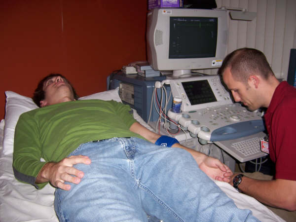
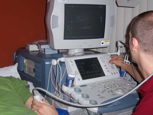
To begin collecting data to analyze, a procedure is done to measure the thickness of the blood vessels after stopping blood flow for five minutes. Subjects are instructed to lie supine on an examination bed, while a blood pressure cuff is wrapped around his/her forearm. Images of the brachial artery are visualized on a computer screen using a Doppler Ultrasound. Baseline images are obtained after fifteen minutes of supine rest and also during and after five minutes of forearm occlusion, which consists of inflation of the blood pressure cuff to a pressure of 240 mmHg for five minutes. (Pictures of the procedure taken during a visit to Pennington are below.)
The release of the inflated cuff results in increased blood velocity, which provides the trigger for the endothelial cells to release nitric oxide. Nitric oxide causes the smooth muscles of the brachial artery to relax and vasodilation of the vessel ensues.
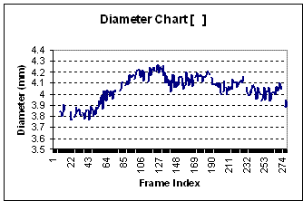
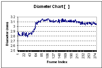
Therefore, endothelial function has traditionally been defined by the percent change in vessel diameter from rest to peak dilation. Researchers tend to look at a percent dilation sixty seconds after the blood pressure cuff was released, because they thought the peak dilation would occur at sixty seconds. However, if attention is focused on only one measurement of percent dilation, one may miss the true peak. So therefore, it is better to look at a pattern of data because some people may peak before the sixty-second mark and some after. An early peak in dilation may indicate that more nitric oxide is released, which indicates a more efficiently functioning system. With most people we notice an initial reduction in the diameter of the vessel before the increase right after the cuff is released.
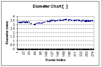
After reviewing the graphs of many different subjects of varying age, gender, and health status, we notice some of the graphs produced resemble a linear graph (see graph #3) while others show a slight dip early and then a dramatic increase before leveling out to normal (see graph #1). Younger subjects tend to have a graph resembling the latter, while older and/or unhealthier subjects produce graphs somewhat linear.
Problem & Goals:
The main goal of this project is to produce a better representation of vessel dilation data and to find a mathematical model that will include new parameters to help researchers diagnose new cardiac diseases.
When we first took on this project, we began looking at curve fittings and different ways to smooth the curve. While looking more closely at the data, we noticed that it was extremely noisy and needed to be cleaned of outlying data points. Also, since the researchers in the kinesiology department largely deal with Microsoft Excel, we were faced with another challenge. In the math department, we learn to use a program known as MATLAB, which makes creating mathematical programs more user-friendly. So another objective of ours was to find another way to transfer any programs in MATLAB to Excel and vice versa.
Mathematical Approaches:
Smoothing the first type of data was relatively simple. First, the data's mean is computed and then the standard deviation is calculated. Next, the distance of each individual point from the mean, that is, the absolute value of the difference between each data point and the mean, is determined. Then, a standard deviation multiplier is chosen depending entirely on the range of the data. Finally, if this distance exceeds the product of the standard deviation and its multiplier, then the data is excluded. Additionally, for horizontally linear data, instead of deleting a data point, the mean will be returned in its place.
This method is implemented in the MATLAB program entitled "Clean". Cleaning non-linear curved data represents a more difficult task because of Excel's inadequate mathematical prowess. Since curved data often has a very high standard deviation, the method used for linear data will not work properly and has potential to exclude valid data points while including noisy ones. However, the same principle can be applied to curved data in small sections. The problem arises in that the standard deviation multiplier for each data interval has the potential need to differ from the ones before it in accordance to the range of the data interval.
We were unable to implement a method to do this readily in Excel. We were thus able to execute a method similar to the rolling averages done in MATLAB. For a rolling average in Excel, first we need to define the length of our roll. The length of the roll simply indicates how many data points we are going to average at a time. (Note: This number needs to remain constant for each interval to keep the returned data fair). Once this number is chosen, we must compute the average of the points in each roll. For instance, if 5 is chosen as the length of our roll, we will take the average of points 1 through 5 and return it as our new value for point 1. Next, for point 2, we will take the average of points 2 through 6 and return that value as point 2. Once an average is computed, it is sent to a new data set. This means the data used in computing the rolling average for each point remains the same throughout the whole process. No old data is rewritten and then subsequently used in the computation of a new average for a consecutive point. This is troublesome to do in Excel, but is manageable using the OFFSET formula and both absolute and non-absolute cell references.
One limitation of using Excel is that data must be averaged rolling to the right. Using a roll that averages to the left and to the right of any given data point can produce multiple errors for data points close to the beginning of a data set, in accordance with the length of the roll. For instance, if points 1 - 5 are respectively listed in cells B1-B10, and the length of my roll is 10, Excel will attempt to reference cells that do not exist. Once these two Excel spreadsheet templates were created, that is one for linear data and one for curved data, they were considered an acceptable temporary fix until more sophisticated methods could be implemented.
At that point, Professor Wolenski instructed us to implement an add-in in Excel that links directly to MATLAB. This method allows us to operate using MATLAB's mathematical capability, and to satisfy the kinesiology department's wishes of keeping data sets in Excel. Typically, data is entered into MATLAB, or into Excel and then to MATLAB. The data is then sent through multiple custom functions we programmed into MATLAB. The same concepts used in smoothing data listed above can be easily programmed into individual function calls in MATLAB. Once the data has been smoothed or changed in whatever way deemed pertinent, it can be easily exported back into Excel for extraction or direct presentation.
Our Accomplishments:
Throughout the semester, we primarily focused on cleaning the data and figuring ways to transport programs from MATLAB to Excel using the add-in link. Our finished product resulted in creating several programs and algorithms useful in taking noise out of data received from the LSU Department of Kinesiology. The programs created for cleaning data were acceptable to the researchers' expectations and the Excel add-in link to MATLAB will be significant for future analyzing. This add-in link enables the researchers to continue using Excel and still get the benefit of MATLAB programs.